A Pictorial History of the SRNL Logo
Savannah River National Laboratory (SRNL) was founded as Savannah River Laboratory (SRL) in the early 1950s. The lab was established at Savannah River Plant (SRP) by E.I. DuPont de Nemours, Inc. (“DuPont”), which built and ran the site under the auspices of the Atomic Energy Commission, to support the production of materials for the nation’s nuclear arsenal.
DuPont’s corporate trademark became the official company logo in 1909. The logo was mathematically standardized in 1948 after an internal audit revealed that more than 40 versions of the logo were in use around the company.
DuPont’s oval logo was synonymous with the company for decades, not unlike iconic logos for many other large companies to this day, from computer to sneaker concerns. It was in use at SRP, including at the top of the Savannah River Plant News newspaper, but was not used to formally represent the lab.
SRP News logo featuring DuPont logo.
The origins are unclear, but sometime in the early days of the lab a dedicated Savannah River Laboratory logo was adopted. The logo was green and contained a stylized atom.
It did not contain a direct reference to SRP, indicating that SRL was considered a semi-independent entity on site. In those years, the logo was not always present on official lab materials and was not used routinely on the cover of lab documents.
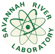
SRL logo used until 1992.
That original logo was used until, and a few years after, the switch from SRP to Savannah River Site (SRS) in 1989, when DuPont left the site and Westinghouse Corporation assumed maintenance and operations.
In 1992 SRL was renamed Savannah River Technology Center (SRTC). Sometime between that year and 2000, the logo was changed to an SRTC logo. The color was changed from green to blue with a right-facing arrow.

SRTC logo used until 2000.
In the early 2000s, the logo was changed again, and reverted back to a green motif. For the first time, the motto “We Put Science To Work” was featured.
SRTC was spelled out and horizontal lines were added, as was a stylized globe.
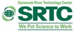
SRTC logo used from 2001-2004.
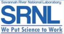
This logo was used for only a few years, as the SRTC name was abandoned when the lab became a national laboratory in 2004. The lab was designated as Savannah River National Laboratory, and became the youngest of the 17 Department of Energy national laboratories.
The first SRNL-specific logo, in use for a short period of time in the mid-2000s, changed colors yet again (back to blue) and the globe was removed. The motto and horizontal lines were retained.
SRNL logo used from April-July 2004.
SRNL used two known iterations of the logo for the first decade as a national lab. The globe was reintroduced as a red icon from 2004-2009 (below left), and black lettering was employed. Yet another color change, from a red to a blue globe (below right), accompanied the logo in use from 2009-2013.
SRNL logo used from 2004-2009.
SRNL logo used from 2009-2013.
The general design of the logo in use today began to take shape with the logo used from 2013-2022, although a green horizontal bar was added.
More importantly, that logo contained the Savannah River Nuclear Solutions (SRNS) name, who ran the lab at the time.
SRNL logo used from 2013-2022.
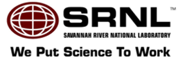
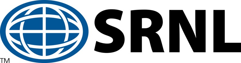
In 2021, SRNL formally separated from SRNS and became a stand-alone entity run by Battelle Savannah River Alliance (BSRA). The logo in use from 2022 to today is blue only but does not contain a reference to BSRA.
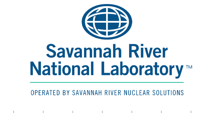
For consistency, and as a registered trademark, the logo has strict branding requirements for its use, which are outlined in SRNL’s Visual Identity Guide.

SRNL logo used from 2022-Present.
According to the guide, “Correct use of the SRNL logo helps ensure a positive, consistent and enduring image is associated with the laboratory’s identity.” SRNL strives every day for preeminence in science and technical innovation, and the sight of our logo should evoke thoughts of excellence.